Wednesday, December 30, 2015

Revisiting 'Squares in Love' for the new year

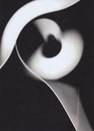
Pierre Cordier & Gundi Falk, Squares in Love, 2011
You've seen this chemigram before: it was the end-of-the-year postcard greeting that Pierre sent to our blog in 2011.  Everyone enjoyed it then, and we thought we'd dust it off after four years to see if it has retained its enchantment and sweetness.  The good news is that it has, and even improved with age, which suggests we may have missed something on the first go around, either that or we've grown in artistic wisdom, perhaps in the emotional stuff too.

Recently I asked him if the pucker and kiss action between each pair of amorous squares had been planned, and he said no, they did it on their own.  I believe him.  Squares from time to time will do that, unattended, as we know from experience in our own studio.  One of the mysteries of the process is that we're not alone when we create a chemigram but instead, despite ourselves, soon find as we work that we have company, little beings that come to inhabit lines and spaces and move by themselves, where they will, on dark schedules and at glacial speeds.  But given enough time anything is possible, even love - or, as we calculated in a post in November of 2010, a trip around the world on the back of a mackie line.  This cannot fail to encourage us for the coming year.

Taking a closer look, we are able to enjoy the subtle unevenness in the nested ranks of color, converging from all directions: while overall the same in pattern, on the micro scale they're quite rippled and lapping.  This tends to make them appear fuzzy, but satisfyingly so, an aspect we embrace, a fuzziness underscored as well by the sharp accents of the imperfections, motes, and dust specks - all of them accidents - which the artists have wisely left behind, calling them 'beauty marks' to keep with the anthropomorphic 'love' metaphor.  Here's a close-up of the right lower quadrant:

detail, lower right
Suddenly at this level everything starts to change, and the kissing activity of the squares is forgotten: it is as though we are examining a histological sample of tissue and instead of ectoderm and muscle the real players are now nerve bundles and nodes of genetic material.  We have zoomed in past the living image; it grows stranger, more exotic - and yet it is the same and has been there all along.  From sweetness and light to another world - and back, as we pull away again.  The picture bears viewing on all levels and rewards you handsomely for it.

We offer some basic production facts.  The paper is Ilford Galerie 21K, the resist is Golden Glossy spray varnish.  The back was covered with a sheet of adhesive to reduce unwanted seepage of moisture, in an effort to prolong adherence of the resist on the front.  The picture we have called 'Squares in Love' above is actually part of a larger picture consisting of 1531 squares (yes!) from which this one, or these squares, were culled.  The proper title of the parent picture, for the record, is Chimigramme 1/9/11 II, so that 'Squares in Love' is actually a detail of it.  It should be noted that not all the squares in the parent picture were in love, far from it.  In fact, the artists had to go over it with a loupe to find those that were; we're grateful for their diligence.  It was completed in 2011, the first year of the collaboration between Pierre Cordier and Gundi Falk. 

Happy New Year.


Monday, November 30, 2015

Cameraless at Soho Photo


Soho, New York City

Soho Photo, formed nearly half a century ago and still going strong, is a cooperative photo gallery tucked into Lower Manhattan opposite the ultra-hip Roxy Hotel.  Its shows are always of interest, and every year they put on an alternative process exhibition where you can view some of the best in historical methods: tintypes, calotypes, daguerrotypes, cyanotypes, gum bichromates, lumens, and (not so historical) chemigrams.  We went down to inspect the turnout this year and our eye was immediately lured by the cameraless end of the roster, where beautiful and accomplished chemigrams predominated.  Is it my imagination, or has the number of chemigrams represented increased over the years?  As I recollect, a decade ago they didn't even know what a chemigram was -  I phoned them back then and they had to look it up in a dictionary.  This year there were four chemigrams on the walls.  So, at this rate...


First, here is Veronica Hodgkinson with The Grid (2015), looking unselfconsciously minimalist like an early Cordier or, to make the point more emphatic, like a Carl Andre version from 1969 at the Tate in London.

Hodgkinson, The Grid, 2015
Andre, 144 Magnesium Square, 1969

If you love your chemigrams you'll love this one.  Each square seems to be relaxed about where its imagery is heading; nothing's in a hurry.  The chemistry and resist do the work, with Veronica looking on patiently, tweezers in hand, for the right moment to assist or not.  It's the classic look but I never tire of it.  Incidentally, the resist was not what you think: it was sticky labels - Rich will be excited to hear that - so we can assume the whole procedure took relatively little time, start to finish.  The paper was Kodak AZO, single weight, expired 1977, and her chemistry was from Sprint.

Hodgkinson, Losing It, 2015

In a somewhat different vein is Losing It (2015), a glorious, dancing bit of hybrid work, with photogrammed blots of human hair, presumably the artist's, merging with tiny pools of chemigramish material at each station of a balletic space.  It was created on Kodak Polymax II RC paper, expired 2003.

Nolan Preece is seen with The Clearing, a resist-driven piece, the tiny crackles and fissures in the surface amounting to a signature of sorts for the type of acrylic floor wax that he used.  The whole conception is simple and rather effective and quite welcome.

Preece, The Clearing, 2015
 Here's a detail from the lower left of the picture:

Preece, detail


His linework has an almost fractal quality, in that the closer you get the farther you see you must go to get it all.  It is this infinitely self-generating property of chemigrams and their resists that endlessly fascinates.


Eva Nikolova will not be left out, contributing a large paneled work entitled Tributaries (2015) consisting of 12 chemigrams 5x7" each on Dupont Defender Velour Black, expired 1944.


I never quite know how to talk about her work: is it history or geography, vision or curse?  Are these deep placid rivers draining a ravaged landscape to the sea, where it will be cleansed and renewed?  Like so many chemigrams, this one must be seen up close (maybe at 3 inches!), so we will look for clues there.  Especially telling is the deft treatment of her trademark resists - peanut butter, guava paste, marshmellow fluff (see the previous post), but for us they both reveal all and hide everything as quickly.  And like in Preece's work, the closer you get to it the more you realize you don't know anything.  It's that damned fractality of chemigrams that gives us amazing work like this - in part, but the rest is pure Eva.

Nikolova, detail

Nikolova, detail
veronica-hodgkinson.com
nolanpreece.com
evanikolova.com
sohophoto.com

Friday, November 13, 2015

A recent chemigram workshop at ICP with Eva Nikolova

figure 1

At the last minute, Rich Turnbull, my usual co-conspirator and fellow chemigram artist, couldn't make it - they needed him at the Metropolitan Museum to lecture on some bizarre topic that he's expert on, or soon would be if you gave him an hour or so with Wikipedia.  Rich is their back-up academic star and they know it, which, if I were less diplomatic, I would call star abuse.  So I had no choice but to turn to Eva Nikolova to fill in for him and what an unexpected surprise that turned out to be, though I'd had inklings of what was going to happen: I'd seen her work in shows around town for several years, her scarred depictions of ruined dream cities made of the most chaste of materials, and had become a big fan.  What I hadn't counted on was how ready she was to communicate her secret processes to the New York public, for that was to come.

In our little chemigram community, Eva is known for introducing strange new products into the process such as guava paste, marshmellow fluff, peanut butter, lipstick - the list goes crazily on.  If you divide chemigram resists into hard and soft depending on the length of time it takes them to loosen their hold on the photographic paper, the items in Eva's toolbox are all soft resists, which can be used separately or together with 'traditional' soft resists like PVA glue (Elmer's glue) or Karo syrup.  Some are displayed in figure 2, waiting for students to overcome their uncertainty and try them.  Most definitely, Eva is not a purist.

figure 2

Herewith I give you samples of the work our group turned out by day's end, much of it fascinating, all of it entertaining; space limits me from showing more but I could.  As facilitators and guides in this, our job is to point the students in certain directions, show them established methods, suggest possibilities, and then let them have a go at it.  At first they proceed tentatively, feeling their way along, but soon enough they find the handle, or a handle, and begin to assert themselves.  One of the joys of teaching this is to watch the inventiveness of these encounters, student to photographic paper, with their quirks and the individual trace of their personalities, as they embark into regions not only unknown to them but, we soon realize, oftener than we like to admit, to us as well. 

figure 3


figure 4

Here's one that's as rich in depth as you could want, done with what appears to be a combination of guava paste and peanut butter - correct me, readers, if I've got this wrong.  Any lipstick?

figure 5

There's more.  Figure 6 (fig. 1 and 3 as well) shows the rich dark reds obtainable from certain vintage papers, dating from those golden days before papers got their cadmium reformulated away (see our post on this here), not to speak of other mystery substances.  Taking a page from Alison's notebook, Eva thoughtfully provided us with a bounty of gifts: Kodabromide E4 SW expired 1941, Kodabromide F-1 Glossy DW expired 1967 ("dreamy blues, lavenders, silvery greys" says Eva), Dupont Defender Grade 3 DW expired 1951, and Ilford MG 26K FB Velvet Stipple DW expired 1962.  It makes my eyes misty to think about it.  My contribution was the comparatively prosaic Adorama FB Glossy and Fomatone FB Matt, with odd leftovers of Ilford thrown in.  


figure 6

In figure 7, note the canny use of the remaining hard resist (Golden MSA varnish) as design element on a piece of Ilford FB paper.  Most would have continued until all the resist had lifted - I might have too - but not this artist.  A nice call indeed.


figure 7

Figure 8, below, shows what can be done with PVA glue if the snatch point is carefully calculated - by intuition of course.  If snatch point isn't already a keyword in this blog, let's make it one.  That's the moment, usually quite early in the tray dance if you're using soft resists, when you snatch the paper out of one chemical very quickly and thrust it into another, in order to suddenly arrest the action.  A matter of seconds can make all the difference.  In the lower part of the picture observe the white skid marks from the hydrodynamics of a sudden thrust into developer from a fixer launch.


figure 8

We can learn something from each image we present - each has a tale to tell.  For now, pay particular attention to figure 9, where two thickly slathered arrays of Eva's resists have received the same chemical attacks.

figure 9
In one peanut-butter is the main actor, in the other it's lipstick.  Here's a detail of the upper part:

figure 9, detail

Let's look at more work, picking them almost at random.  Here's a soft-resist I like.

figure 10

And another, with hybrid marks drawn from different traditions.

figure 11

Sometimes, the softest marks are those that stay with you the longest.

figure 12

Participants included Mary Alestra, Michelle Bratsafolis, Carol Chu, Sarah Davis, Mira Dayal, Nadezhda Neusypina, and Kiera Wood.  Hats off to all!

                                                   *  *  *

For those interested, Rich Turnbull is doing a chemigram workshop on November 21 at the Penumbra Foundation, just 8 blocks south of here in midtown Manhattan.

International Center of Photography  
www.icp.org

Eva Nikolova
www.evanikolova.com

Penumbra Foundation
www.penumbrafoundation.org

Douglas Collins

Wednesday, November 4, 2015

The end of the photogram: Roger Humbert

Humbert, IMG_2699. 01.10.2013, 2013

When you first see a picture by Roger Humbert, you know you're in the presence of an artist unlike any other who has dealt with light.  It is a medium he has made his own (as if he had the authority to do so), along with its consorting twin, shadow.  Each defines the other, whiteness and darkness, energy and its absence.  His mind runs over the wavelengths of its spectrum as a pianist's fingers run over the keys.  It's both immanent and elusive, and he thinks about it all the time.

Humbert, IMG_2764. 01.10.2013, 2013

Much has been written of his connection in the early 1960s with the movement known as Concrete Photography, which promoted the idea that a certain minimalism had a philosophic content, or perhaps the other way around, that phenomenological currents in intellectual circles led to a reductive photography.  Influenced in any event by the writings of Max Bense and the graphic work of Swiss compatriot Max Bill (all these Maxes in the service of minimalism!) it found its roots ultimately, going back further, in the Bauhaus teachings of Laszlo Moholy-Nagy and before him to Coburn.  We touched on that in an earlier post last year.

That agenda - and the work of the four or five artists gathered at the time for ground-breaking shows in Basel, Bern and Zurich - seems at this juncture, in my opinion, to have been little more than a pretext for critical ponderousness or puffery for a sales pitch to an uncomprehending public.  Addressing those critics, it's not helpful or insightful to claim that photography was becoming self-referential, gazing at the processes that undergird it.  That comes off as obvious, but only because those making the work had driven themselves to do it: it was not necessarily in the plan.

Humbert, IMG_1429. 15.12.2011, 2011

Humbert, IMG_1960. 20.04.2012, 2012
Humbert, IMG_1160. 03.11.2013, 2013

And still, the record shows Humbert preceding the movement by a decade and surviving it happily for many more, no thanks to the commentariat.  He is the real deal, and he is still producing the work.  His is not a postured minimalism but rather one informed by a passion to understand - and, if not understanding fully, for who can, then to depict at least what light really is for us or may be, this thing that is not object but event, surface, density, and more.

Mächler, Sechs quer strahlend, 1971
Even his great countryman and contemporary, the late René Mächler, was not able, in the end, after many years, to approach the mysteries of light with the sensitivity of Humbert.

It all began in the darkroom in the late 1940s, with an enlarger and a tray of photographic chemicals.  Using stencils he would cut out and computer punch cards, a relic most readers of today have never seen, he created photograms.  Then he would move light around to make luminograms.  He used all the methods others have used to explore light (Matter, Jacobi, Arthur Siegel) but without the theatrics or the sentimentality.  Some would say he has paid the price but he would just give us that wan enigmatic smile of his and say he has only gained by it.

Humbert, untitled, 1955

Today he has transitioned to digital in keeping with the times, but here are some earlier works, all analog, now housed in the Fotostiftung Schweiz.  Notice how much the energy in these earlier pictures was made explicit through rapid gestural shifts and the layering of photographic material, whereas now, to imply this energy, all he has to do is massage the depth of field and the bokeh, and use the reductive tension set up by nuanced pools of darkness.  Humbert is a master of this and his recognition is growing.  Photo Edition Berlin recently hosted a solo show of his latest work and published a catalog from which some of these images are taken: you should go out and get it.

Humbert, untitled, 1968

On YouTube, in a conversation with Gunther Dietrich, he recently said he's approaching the end of photograms and of his life-long study of light, that there's nothing more to be done.  From this it's evident that each picture for him is more than just a picture, or less than one: it's an exploration, a journey.  His work is as much science as art.  There is no need to revisit where he has gone before, he has already shown us what is there.


Roger Humbert, 2015


Friday, October 16, 2015

What we cannot speak of, we must remember


Sarachek, After Fukushima (O), 2014

As visual artists, we are most sensitive to what we see.  What we see in fact could be said to become part of our body's tissue, which soaks in, while we walk around and conduct our lives, events happening or glimpsed at the most remote distances, as well as those from nearby, not to overlook those from the snapshots and clips of television, magazines and cinema that our culture has so carelessly laid before us.

With our organs of sense therefore we extend ourselves, and what is there is also, by this extension and in a way, within us.  We may ignore it - we are free to do so, as some artists strike a pose of doing - or we may be so engaged emotionally by it that we are wracked with outrage, heartbreak, and despair.  There is an art of protest that comes from this, often reduced to naive cartoons, graffiti and posters, as if all the rights and wrongs were already established in everyone's mind; and there is a deeper art that is itself a struggle for expression.  One thinks here of Goya's El 3 de mayo (1814) in the Prado or Picasso's Guernica (1937) at MoMA, pictures of a specific time and place and yet the most devastating statements imaginable about man's injustice to man.  There is also an art of response, call it political or not, which, quite unlike these stirring calls to arms, sustains itself more softly as meditation, commemoration, memorial, or prayer, and may last the lifetime of the artist.  Examples abound; to mention them all would constitute a poem of epic length, a prolonged lament for life and for peace on earth.  One favorite of many is the 40-year series of pictures by Robert Motherwell, Elegy to the Spanish Republic, begun in 1948 but based on memories of the Spanish civil war a decade earlier.  Some versions are of an astounding simplicity of gesture, such as this lithograph in the Tate.

Motherwell, Spanish Elegy I, 1975
This appropriately brings us to the present exhibition of works on paper, twelve chemigrams in all, together with an installation of ceramic funerary bowls, by Norman Sarachek entitled After Fukushima, on display at the New Arts Program Gallery in Kutztown, Pennsylvania, until November 1, 2015.  Norm's intent is to draw attention to the meltdown of four nuclear reactors in Fukushima, Japan, in March 2011, with the accompanying release of deadly radioactivity into the water and atmosphere that is, quite inconceivably, ongoing to this day, and not only to honor the memory of the victims of that tragedy, which it almost shames us to say in passing, but also to stimulate public discussion of the dangers of nuclear power in its aftermath.

Sarachek, After Fukushima (D), 2014
Sarachek, After Fukushima (C), 2014
 

Sarachek, After Fukushima (H), 2014


The fragile, flowery imagery, lazy with the relaxation of a summer's day, recalls Norm's deft chemigram touches from previous outings, in particular the handsome show he had in Philadelphia in 2010, which we covered then.  The strategies and devices haven't changed much over the years, nor need they : it's a language waiting for good use and he has found it.  His images amass a subtle power as they confute the public's relative indifference to the tragedy and even perhaps ironize it - but it all takes place by tiny, slow movements which achieve their graded effect almost without one's noticing.  He helps complete the picture by placing funerary bowls containing clear glass beads, an allusion to radioactive particles, beneath each picture, with inverted chopsticks that, I'm told, symbolize death.  It's his conception that each picture becomes an altar.  OK, maybe the staging's too obvious, but maybe also it has to be : the exhibition will serve as a platform for future poetry readings in traditional Japanese modes and for public discussion of issues raised by Fukushima.

Sarachek, After Fukushima (L), 2014

installation view showing funerary bowls

Sarachek as pot-maker

Sarachek's chop on lower right of an After Fukushima scroll
The twelve chemigrams are printed as an edition of 10 on Moab museum rag paper, each presented as a 56 x 24 " scroll, in further tribute to traditional Japanese practice, with an impressed chop in the corner fashioned by Norm himself.

For further information, the reader is invited to contact the artist at his site, www.nsarachek.com.


Sunday, September 13, 2015

Luminograms from Wales

Jackson, Luminogram study #98, 2015

Jackson, Luminogram study #216, 2015

Jackson, Luminogram study #115, 2015

Michael Jackson is a photographer from Pembrokeshire, Wales (UK).  He lives in a darkish valley just a short distance from the ocean, a proximity that has had a major influence on his work.  He hikes along the cliffs, stares out at the rocky stacks off the coast, or he descends to the tidal coves and spends hours and days alone with his camera, studying eddies in the sand, patterns of flux and reflux.  He listens, watches, and feels.  He meditates.

the artist on the sea-cliffs

Back in the studio, he seeks ways of transmuting this heightened experience into images on paper that will remain a source of continual challenge and excitement for him - to the point where, in fact, it is these that become the main event.  He calls it 'creative play'.  Years of working in the darkroom have honed his method to a fine pitch and reduced it to its essence, which is the study of light itself: what light can do to fool or enchant our perceptions when it's bounced off the silver compounds in the paper, what magic-lantern effects it leaves us bedazzled with.  If this sounds just a little familiar it should be, for these things, these prints, have been known as luminograms since Moholy-Nagy in the 1920s.  Mike had no idea until Gottfried Jäger pointed it out to him - he thought he'd invented it by himself, the same story many an alt-photographer tells about his or her corner of the craft.  

He uses no camera  - doesn't need it - and no film.  As to the light, it may shine squarely down, from an enlarger, or shine rakishly, beaming in from the side; he may have erected scrims or gobos in the light's path or maybe not, depending on inspiration; we do know, or strongly suspect (he's justified in his reticence), that he moves structures around during the exposure, uses torn or folded papers, small constructed models, objects at hand in the darkroom, and maybe even waves his hands back and forth in there too, in a sort of shadow performance.  He calls his work 'gestural' if anything, and that's a clue, but even then he's not finished.  Think of everything you can do in a darkroom and Mike has done it: double exposures, paper negatives, solarization, more.  His technique is evolving with a rapidity only matched by his production - more than one completed print per day over the last six months.  Someday, when he's not so busy, Mike will tell us all.

Jackson, Luminogram study #167, 2015


Jackson, Luminogram study #243, 2015
Readers will want to know some darkroom details and here's what I can share with you.  When he began he used expired RC paper because it was given to him and it'd be crazy not to use it, but he's moved on to fresh material, typically Ilford Multigrade Glossy.  Both work about the same.  Fiber based paper on the other hand doesn't work well at all in Mike's version of the process, he's not sure why.  His experience with some of the great vintage papers referenced here on the blog is slim; he's fine for now with what he's doing.  He uses standard Ilford developer and fixer, nothing tricky there, but he has done a lot of trials varying both their temperature and their mode of application: dripping, spraying, etc.  His solarization methods are what most command my attention - they appear extremely refined and successful, with an almost mezzotint-like delicacy of soft-focus edges and limpid greys; he admits this had been a major area of trial-and-error for him.  He should be very happy with the results.

Jackson, Luminogram study #102, 2015
Somewhat the exception to much current practice, he treats each print as unique and has no interest in editioning them.  'I want to do a print, learn from it and then for it to be in the past - rather than reprinting it over and over... I like the idea of it being similar to how painters work and move forward.'  The advance of time is relentless, just as the oceans continue to slowly grind away at the cliffs of Wales.  There's no looking back.

Jackson, Luminogram study #288, 2015
For those needing to know Mike Jackson better - and you should, there's much more than I've told you here - go to his site at www.mgjackson.co.uk and explore with open eyes.  I don't think I'm alone in finding his work profoundly amazing.